← Back to Projects
UX Design Productivity Mobile App

TimeWise

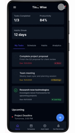
A smart all-in-one productivity app that helps busy users plan tasks, manage schedules, and build habits from a single, distraction-free dashboard.

5 Months Duration
4 User Personas
2 Usability Rounds
TimeWise Hi-Fi Dashboard showing tasks, productivity stats, and habit streaks

The Problem

Unorganised lifestyles lead to unbalanced work-life and study-hobbies routines. Users struggle with managing time effectively and maintaining productive daily habits.

I initially assumed only working professionals faced this challenge, but secondary research revealed that students, parents, and career changers all struggle equally with time management and daily task organisation.

My Role

Lead UX Designer & UX Researcher

Timeline

Sep 2025 – Jan 2026 (5 months)

Target Users

Students, Working Professionals, Parents, Career Changers

Responsibilities

User research, personas, journey maps, wireframing, prototyping, visual design

User Research Pain Points

Unorganised Life

Users struggle with managing time and maintaining a structured daily routine, leading to missed deadlines and unbalanced priorities.

Financial Constraints & Productivity

Budget limitations affect tool choices, while poor productivity compounds financial stress for career changers and students.

Efficient Task Prioritization

Users lack a clear system to prioritize tasks effectively, leading to decision fatigue and procrastination on important work.

Juggling Multiple Responsibilities

Balancing work, studies, family, and personal goals simultaneously creates overwhelm and reduces performance across all areas.

User Personas

Aria — Student & Learner

A busy university student and intern who needs an efficient way to manage academic, internship, and networking tasks because she struggles with prioritization and risks missing valuable career opportunities.

Daniel — Working Professional

A professional with a demanding job who needs a better system to manage his workload and prevent burnout because task overload and lack of structured prioritization affect his productivity and work-life balance.

Neelam — Parent & Caregiver

A dedicated teacher and parent who needs to balance classroom responsibilities and family duties without feeling overwhelmed because time constraints lead to stress and reduced efficiency.

Elliot — Career Changer

A career changer working in a demanding job who needs a structured way to balance work, studies, and finances because his irregular schedule and financial concerns make it difficult to stay consistent with learning goals.

User Journey Insights

Design Process

Phase 1 Research

Paper Wireframes

  • Drafted multiple iterations to address user pain points around productivity
  • Dashboard with action-first hierarchy: key metrics at top, Quick Actions in bottom bar
  • Explored multiple settings information architectures
  • Selected layout based on usability and simplicity
Paper wireframe sketch of TimeWise dashboard
Phase 2 Wireframing

Digital Wireframes

  • Action-first dashboard experience — monitor and act on tasks in one glance
  • Bottom Quick Actions (Schedule, Habit, Reminder, Add Task) for immediate access
  • Settings with expandable categories for intuitive navigation
  • Unified hub design to eliminate screen-switching frustration
Digital wireframe showing TimeWise dashboard layout with task completed, productivity, and upcoming sections
Phase 3 Prototyping

Low-Fidelity Prototype

  • Interactive prototype built in Figma for usability testing
  • Core task flows: creating tasks, scheduling, habit tracking
  • Settings navigation and configuration flows
  • Prepared test scenarios for usability study
Phase 4 Testing

Usability Studies (2 Rounds)

  • Evaluated navigation, core actions, and productivity insights
  • Identified usability barriers and validated design assumptions
  • Refined experience based on real user behavior and feedback
  • Addressed inactive dropdowns and dead-end interactions
Phase 5 Final Design

Hi-Fidelity Mockups & Prototype

  • Refined interface based on usability testing feedback
  • Implemented functional dropdowns and interactive elements
  • Applied visual design with accessibility considerations
  • Built complete hi-fi prototype in Figma
Hi-Fi dashboard with tasks, productivity 84%, and habit streak Hi-Fi schedule screen with daily timeline Hi-Fi habit tracking screen with weekly progress

Usability Study Findings

R1

Round 1 — What Worked

Positive Findings

Quick Actions significantly reduced friction for common tasks. Timeline schedule view improved time awareness. Progress widgets increased user motivation.

Issues Found

Users were unsure where to start on the dashboard. Task creation flow felt unclear to first-time users.

✓ Quick Actions validated as a core UX pattern
R2

Round 2 — Refinement

Critical Issue

Users encountered dead-ends in the Settings menu, specifically within the 'Collaborations' and 'Data & Privacy' sections. Inconsistent interactive elements confused users and reduced trust.

Solution Applied

Implemented functional dropdowns in all Settings sections. Ensured all interactive elements responded to user input consistently. Improved visual hierarchy and feedback states.

✓ All interactive elements now functional — user trust restored

Accessibility Considerations

1

High-Contrast Colors

High-contrast colors and large text were used throughout the interface to support users with low vision and ensure readability in all lighting conditions.

2

Touch Target Sizes

All buttons and touch targets follow minimum size guidelines (44x44px) to support motor accessibility and ensure comfortable interaction on mobile devices.

3

Clear Labels & Navigation

Simple navigation patterns and clear labels improve usability for screen readers and support cognitive accessibility for users of all abilities.

Key Takeaways

"I finally feel like I can see my whole day clearly in one place."

Participants reported feeling more organized and less overwhelmed while using TimeWise. This project taught me the importance of iterative design and validating assumptions through usability testing. Small interface changes — like persistent actions and clearer hierarchy — can significantly improve user confidence and productivity.

Design Tool

Figma — Wireframing, Prototyping, Visual Design

Research Methods

Secondary Research, Personas, Journey Maps, Usability Testing

Key Insight

Iterative design with usability testing at every stage produces better results than polishing first

Future Steps

1

More Usability Testing

Conduct additional usability testing with a larger and more diverse group of users to validate designs at scale and uncover edge cases.

2

Smart Scheduling

Implement smart scheduling recommendations using productivity data to help users optimize their daily routines automatically.

3

Collaboration Features

Explore collaboration features for shared task management, enabling teams and families to coordinate schedules and responsibilities together.

Interactive Prototypes

Click on either prototype below to explore the full interactive experience in Figma.

Low-Fidelity wireframe prototype of TimeWise
WIREFRAME

Low-Fidelity Prototype

Early wireframe prototype used for initial usability testing. Focuses on core navigation and task flows.

Try it in Figma
Animated walkthrough of the Hi-Fidelity TimeWise prototype
✦ INTERACTIVE

Hi-Fidelity Prototype

Final polished prototype with full visual design, accessibility refinements, and functional interactions.

Try it in Figma

Other Case Studies

Explore the TimeWise Prototype

See the complete UX design process from research to hi-fidelity prototype.